Imagine all the people
Living life in peace

Monday, March 29, 2010

Adobe InDesgin Videos

In this tutorial, I learned how to start new documents in InDesign. (File, New or keyboard shortcut etc.) Also, I learned how to use layers, which I am no becoming a professional at. The control panel is convenient because it let's you look at many different features depending on what things are selected (like the object). I also learned how to customize workspaces. turning menu items on and off is a helpful tool when working on a project. Workspace can also be saved so that it can be used time and time again. Master pages in CS3 are easy to use and incredibly helpful, they help create unity in multiple pages. Working with object styles is similar to character and paragraph styles- fill, stroke, transparency effects etc can be altered using this feature.

I think that the tips about object styles and the cusomization of the work space will be helpful in the upcoming projects because they will help in creating a comfortable and familiar set up, making my work that much easier.

Technical Training Video

In these videos, I learned how to use layers with ease, as well as how to convert objects to black and white. Also, I learned how to use the filter to stylize and change the stacking order of effects. Also, how to change the white balance, by using the eye dropper. The midtones of the image can also change without changing the highlights of the object. Improving tonal corrections is also a great way to change the tonality of the image on an RGB scale. The soft edge brush, in white, can be used to lighten pieces of a image. Lastly, I learned how to import into InDesign in a series of different ways.

I thought that the video on layers was most helpful, because at this stage in my photoshop work, layers is one of the biggest things I have trouble with.

Technical Training Video

In the Adobe InDesign CS3 videos, I learned how to use the selection tool, and the direct selection tool. The double headed arrow allows to to resize the width or length. I also learned how to change the curning and tracking- and in order to apply it to all of the paragraphs, you can make a paragraphs style section. I learned that you can make style sheets so that you can make certain parts of a document the same, with the click of a button (i.e. headings, sub headings). The numbered list formatting is easy to use, with the press of the return key (once formatted). Also, I learned that in order to get text to wrap around an object, you must use the text wrap panel. You can wrap around the frame, the shape inside the frame, on top or below the image, or skip over it. Lastly, I learned hat InDesign can create an array of different documents. To manage pages, there is a panal.

I thought that the video about style sheets was most helpful, especially when it came to creating my resume. That feature has become incredibly helpful.

Logo Design

http://www.pixellogo.com/logos

This resource was helpful in creating my logo design because it gave me a lot of great ideas! The idea of a "logo" can sometimes be confusing, because knowing what exactly constitutes as a logo was never really defined for me. This website helped a lot!

Lesson Plan Resource

http://www.princetonol.com/groups/iad/lessons/elem/pam-matisse.htm

I am currently working on Fauvism, and Henri Matisse with a group of 3rd graders. This lesson plan would be a great addition to the unit because it will effectively demonstrate orally and visually a deep understanding of Matisse’s artwork, which can so often be confusing to children.

Powerpoint online Resource

http://www.brainybetty.com/

I could use this resource when creating a future Powerpoint, because more often than not, the default backgrounds for Powerpoint are not very exciting. This could be used to create a new and exciting presentation!

Self-Portrait Inspiration and Technical / Creative Resources
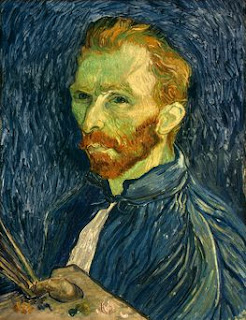
I chose this self portrait of Vincent van Gogh because his style and technique have always been quite inspiring to me. His use of colors, and painterly style is like no other.


I have chosen this self portrait by Andy Warhol because I admire his work so incredibly to begin with, and I think this is a great self portrait because it doesn't merely capture one "side" to Andy, but many.


What is a self-portrait?

A pictorial or literary portrait of oneself, created by oneself.

What are the distinctive things that make me "me"?

My love f

or cheerleading, and passion for a career in Art Education.

How do I want people to see me?

As a role model, a leader, educated and caring.

How can I express my many different sides?

I can express my many different sides through my art work, as well as through cheerleading.

How can I reinvent myself for various purposes or times in my life?

I don't think that I need to reinvent myself... I like the way I am.

Who do I want to become?

I want to become an excellent art teacher, and a pheonomonal cheerleading coach.


www.adobe.com/designcenter/video_workshop/

I will use this website to help educate myself on the Adobe program, while working with my Self Portrait.

Monday, March 8, 2010

Elements and principals of art

In order to create my slide show, I went through pictures from a trip to Florida. I was careful to make sure that my pictures coincided with an element or principal of art, and were aesthetically pleasing. I really just went through the pictures with a list of the elements and principals and when I found one that I liked in particular, I would determine if it did indeed match up with an element.